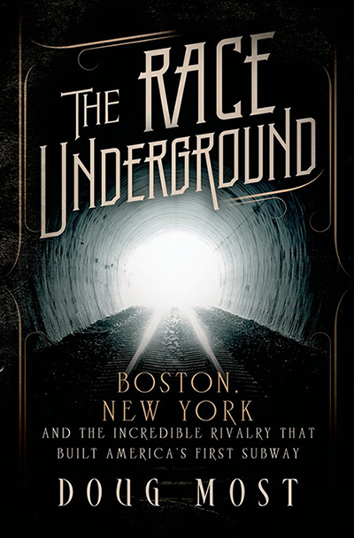
Just as important as the words inside of a book is the design of the outside of the book. A great cover makes you pick up a book, and that’s step one toward maybe buying it. Ever since I saw the cover for “The Race Underground,” I’ve heard so many comments on it, most of which begin, “I love the cover!”
So I decided to email the folks at BookDesigners.com, where my cover was designed. And they put me in touch with the actual designer, Ian Koviak (that’s him goofing off to the left). He lives out in Portland with his family, so we emailed and he answered a few questions of mine that take you inside the world of how book covers take shape and how the cover for my book happened.
Can you explain the process a book cover designer goes through in creating a cover?
Typically, in a traditional publishing set up, a designer will get a request by an art director to design a cover. There are many reasons why an Art Director may choose a designer. Sometimes it’s a style, other times it’s a success with previous titles they have done together. It could be something as simple as typographic sensibility or because they know each other. In this case I cannot say why I was chosen, but I have done a good number of historical fiction and nonfiction titles and am used to playing around with historical typographic arrangements.
In general, a designer will receive a design brief describing the publisher’s needs for the job. Sometimes competitive titles are included, as well as suggestion for genre and style. A manuscript, or synopsis, will be given. Depending on how much time the designer is given, they may read the whole manuscript, parts of it, or just the synopsis. The designer will then research the topic, look at other works that exists on the topic, look at photography/illustrations and other inspirational images that may influence their work/solutions.
After getting a good handle on the books content, the designer may sketch or start to assemble things digitally to see what works with the title and other content. Sometimes, they may start by researching appropriate font treatments that speak to the time periods in the book. Once a basic idea is formed, the designer starts to assemble assorted concepts—typically 3-6 unique ideas. Once done, they send it off and cross their fingers.
The art director presents the ideas to editors, sales folks, the publisher and anyone else in-house that is involved with the project. Usually they will go a few rounds of edits and revisions with the designer before selecting something that they all agree accurately represents the book. Then, this refined idea is sent to the author for review. Sometimes further edits are suggested. Sometimes the project is rejected by everyone and a new designer may need to be selected for the job. While this is sad for a designer, it needs to be done sometimes to get a fresh take.
After you read “The Race Underground,” what struck you the most in helping you create a design?
I read parts of the book and relied mostly on the synopsis, based on the time I had. I grew up in New York and have always been enthralled by the subway system and spent much of my childhood underground getting around to school, home and Coney Island! I guess a large part of the design’s that I came up with tried to capture that excitement.
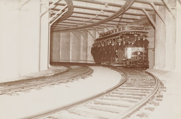
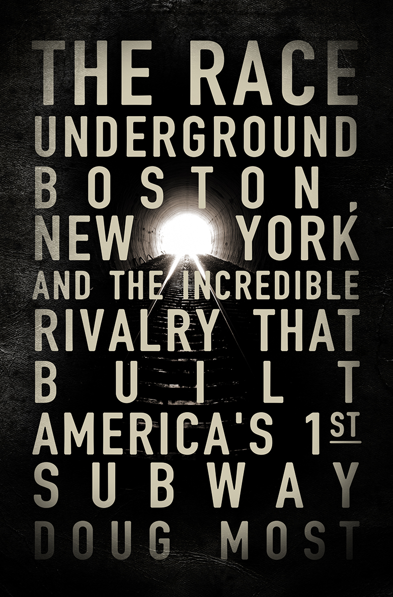
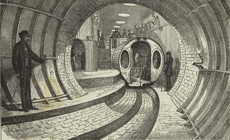
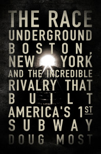
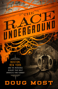
Early on in the process I had researched signage used in old subway cars and terminals and tried a few ideas out with that sensibility. I also played with images from the time period in both Boston and NYC. Ultimately I focused on an image of light at the end of the tunnel–representative of hope, the future, fear, and change. This was the selected idea. We played around with the typography/fonts a few times and shortly after had our final cover. It was a rather painless process and I was very pleased with the final.
 What do you like about The Race Underground cover?
I like its sense of hope and a look into the future. It doesn’t give away too much. It’s not busy and overloaded. The fonts speak to the time periods and the round hole of the subway track reflects the design of the original subways in NY. Overall it’s appropriate for the topic but also breaks the mold in that it almost looks like a novel and not strictly non-fiction which is something I did like about the quality of the writing. It’s not just a dry report on history. There’s intrigue and tension!
Were there some ideas or concepts you tried first that didn’t quite work?
All the ideas had their merit and were attractive. Some were very literal. I suppose the idea that played off the original subway signage was ultimately not translating visually the way I had hoped, so it was scratched early on. I was asked to focus on vintage photography for a few of the ideas—and when I found the image of the classic tunnel, there was something that felt like it draws you in—like you’re actually going down the tunnel.
How did you get into the field of book cover designs?
My parents were both graphic artist and immigrated to Brooklyn, NY form Poland. My father did book jackets in the early 90s for Marc Cohen. I have always loved books and you could say I was born into it. I studied design for 18 months and quickly graduated and went off to work at a small publisher in San Francisco in 2000. In 2005 I left to start my own studio with my longtime friend, Alan Hebel. We formed theBookDesigners and haven’t looked back.
How is the e-book changing the world of book covers?
Aside from the occasional request to make the title bigger for online sales (book covers are usually small thumbnails online) it has had little effect. I work with many self publishers and traditional houses alike. The process is relatively similar. Everything needs a cover and a visual solution to sell. Regardless of the medium. I suppose the biggest loss in in the physical aspect of what it means to hols a book and some of the nuances that are lost in going to a strictly digital format. There is something pleasant about a book that has some extra printing touches and something satisfying to feel a book in your hands and see the pages turn. You develop more of a relationship to it as an object and not just a glowing piece of plastic in your hand.
Ian, thank you so much for a great cover and I hope our paths cross in person some day.
Likewise!
Here are two other cover concepts Ian designed early on for The Race Underground. These are cool, but there’s no question the one on the book is the winner.
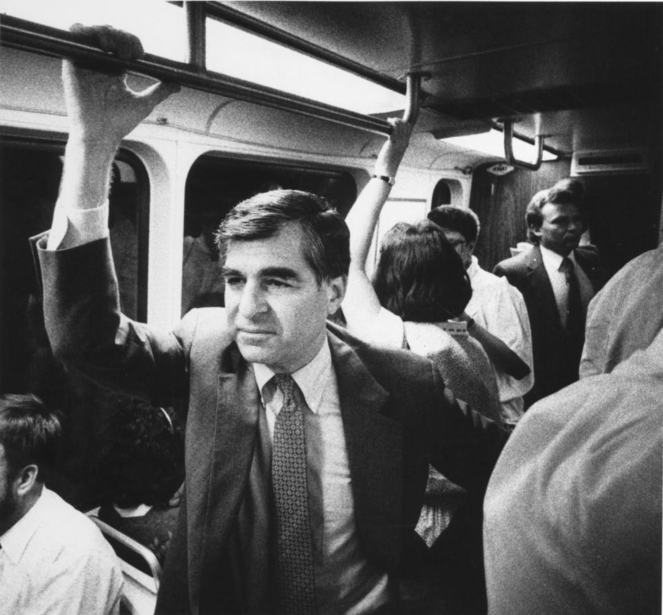
 When I wrote an email to Governor Dukakis about how he wanted to do our event together at the JFK Library on Friday, April 4 (register by clicking here), I was shocked to get a reply in about 5 minutes. I knew he was busy teaching in California at UCLA’s Luskin School of Public Affairs. Nonetheless, his reply tickled me. He wrote: