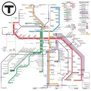
 The next time you ride on a subway, especially New York’s, but really anywhere, take a look at the subway map. That’s a piece of Massimo Vignelli’s legacy. And believe it or not, even a subway map could attract controversy.
From the New York Times obituary: Massimo Vignelli, an acclaimed graphic designer who gave shape to his spare, Modernist vision in book covers and shopping bags, furniture and corporate logos, even a church and a New York City subway map that enchanted aesthetes and baffled straphangers, died on Tuesday at his home in Manhattan. He was 83.
How could a subway map be controversial? Vignelli’s stuck to a basic grid, of 45 and 90 degrees, and at the same time completely ignored any geographic and station location. It was counter-intuitive.
When Boston opened America’s first subway in 1897, no map was needed. The first leg of the system was barely 2 miles of track, from Arlington Street to Boylston Street to Park Street and back. The subway cars were distinguished by the sign on front explaining where they were going, by showing the final destination. Boston’s system would expand in the next few years, of course and today’s subway map is a rainbow of Green, Blue, Red, Orange, and the latest addition, Silver. And the MBTA recently held a subway map redesign competition. The response was overwhelming and you can see and click on the results here.
When New York opened America’s second subway in 1904, it was more than 20 miles of track. And today, the MTA is not about colors, like Boston, but letters and numbers, 1, 9, 2, 3, N, R, Q, J, B, C, and so on.
Of course, if you live in a city with a subway, when was the last time you used its map? Next time you’re riding, take a look at it. As with everything, there’s a story behind it.
Here is Kat Lawrence’s subway map submission to Boston’s MBTA:


Very sad indeed. A legendary example and one of the last of his generation. He left behind some timeless work that we all use and benefit from and has influenced generations of designers to do good work.